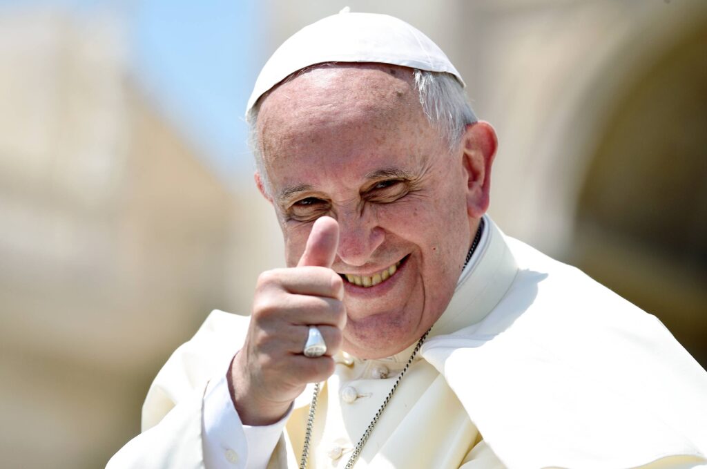
- Pope Francis was recently laid to rest
- However, his tombstone has caught the attention of designers
- What did they notice?
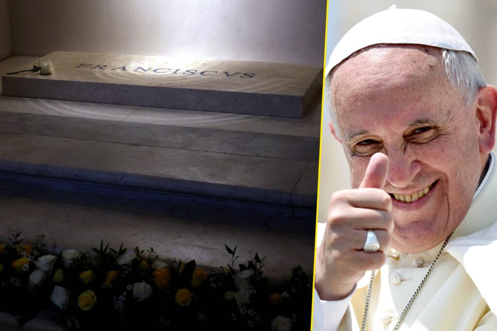
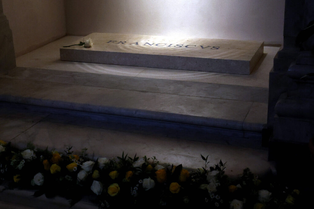
Pope Francis was recently laid to rest but there’s one element of the Pope’s tomb that has caused a particular group of people to lose their minds.
The issue revolves around a design element of the late Pontiff’s final resting place. Images of this humble tomb were recently shared online, with designers focusing in on one particular element.
Read more: Donald Trump accused of breaking strict dress code at Pope’s funeral
It revolves around the spacing of the Pope’s name – or something that’s more commonly referred to as kerning.
If you’ve already familiar with the pictures, then you may have found yourself wondering why the pope’s title appears to have uneven spacing.
Read more: Donald Trump jokes he should be the next Pope
The marble slab that lays on top of the tomb features an engraving of the name “Franciscus” which is the Latin for Francis. However, thanks to the unusual spacing between letters – or kerning – it looks more like FR A NCISC VS.
Naturally, this caused some design-focused folks to lose it online.
Designers react to Pope’s tomb design
Some design addicts took to places like X to share their thoughts, with one calling it “horrible and disrespectful.”
“Unfortunately bad kerning on Pope Francis’ gravestone,” added another.
“Looks like the designer basically measured the space between the extreme edges of the letters rather than account for each letter’s distinct shape.”
“Maybe AI designed it? AI probably knows NOTHING about kerning,” joked another.
Not a mistake after all
Others have offered differing opinions, with some suggesting it is intentional and harks back to “Roman monumental Latin.”
“The inscription #Franciscus on #Pope Francis’s tomb in Santa Maria Maggiore features irregular spacing—not a mistake, but a deliberate reference to Roman monumental Latin, where visual balance outweighed modern #kerning,” said one person online.
The inscription #Franciscus on #Pope Francis’s tomb in Santa Maria Maggiore features irregular spacing—not a mistake, but a deliberate reference to Roman monumental Latin, where visual balance outweighed modern #kerning
— Marcello Di Giovanni (@marcellodigio) April 30, 2025
Please study Art History. It is essential. pic.twitter.com/A7WozJ3cR2
“Please study Art History. It is essential.”
Meanwhile, some outlets have suggested this imperfect spacing is actually a pretty perfect metaphor for the imperfection of humanity. Something that this humble pope championed during his lifetime.